
Wayfinding Signage Design Guide
Practical guidance from the team that surveys, makes and installs commercial signage. If you have a live project, we can help you choose the right route.
Good wayfinding is judged by how little people notice it: visitors simply arrive where they meant to go without stopping to ask or backtrack. That only happens when the sign hierarchy is planned as a system rather than as a list of individual signs added wherever seemed convenient at the time. Offices, schools and healthcare sites all have different visitor patterns, and the right scheme reflects that rather than applying one generic layout everywhere. This guide covers how to plan the hierarchy properly. We design and install wayfinding schemes for offices, schools and healthcare buildings across Hertfordshire, Bedfordshire, Buckinghamshire, Cambridgeshire and London.
We look forward to hearing from you
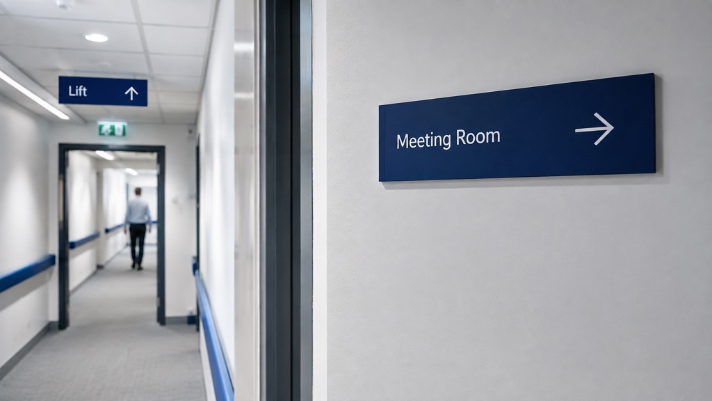
A wayfinding scheme usually works in three tiers: primary signs at decision points like lift lobbies and main junctions, secondary signs confirming a route partway along a corridor, and identification signs at the destination itself.
Planning the hierarchy
A wayfinding scheme usually works in three tiers: primary signs at decision points like lift lobbies and main junctions, secondary signs confirming a route partway along a corridor, and identification signs at the destination itself. Getting the tiering consistent matters more than any individual sign's design, since inconsistent sizing or wording between tiers is what actually confuses people.
Ready when you are
Planning a wayfinding scheme for your building? Use the form above to tell us about the site, or get a fixed estimate directly.
Get an EstimateCommon questions
Yes, contrast, font size and mounting height typically need to meet accessibility guidance, particularly in public and healthcare buildings.
Yes, if specified with a modular insert system, individual signs can be updated without remaking the whole scheme.
This depends heavily on the building's layout and how many decision points (junctions, lift lobbies) exist, which is why we survey before proposing a scheme.
Yes, ideally, though the priority is always legibility first, with brand colours and typography applied within that constraint.
Yes, some sites combine both, using physical signs for fixed routes and a digital screen for frequently changing information such as room bookings.