Work worth looking at closely
These are not stock images or visualisations. They are completed Smiths 1972 projects, selected because each one solves a different problem: shared identification, workplace privacy, dense wayfinding information and a character-led retail interior.
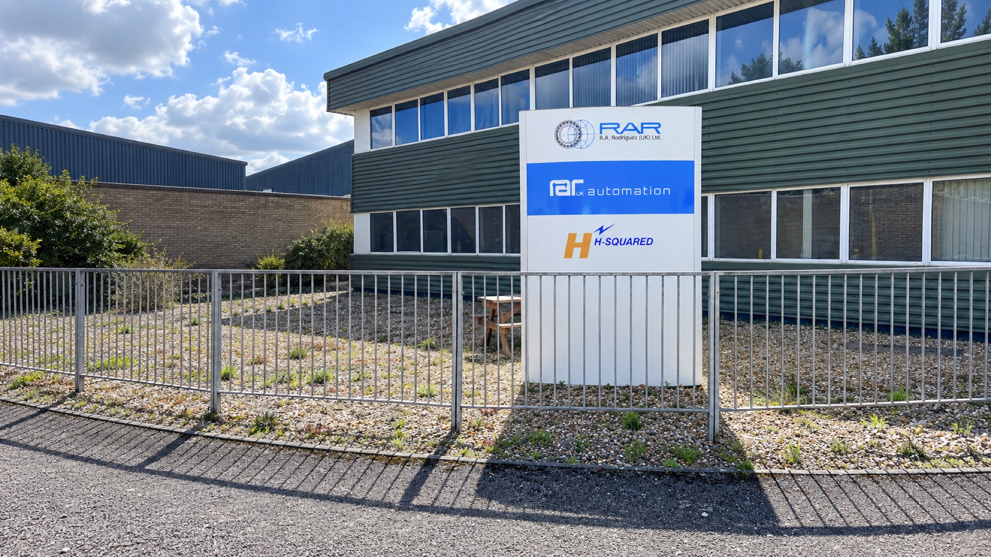
A freestanding directory that brings three business identities into one clear arrival point.
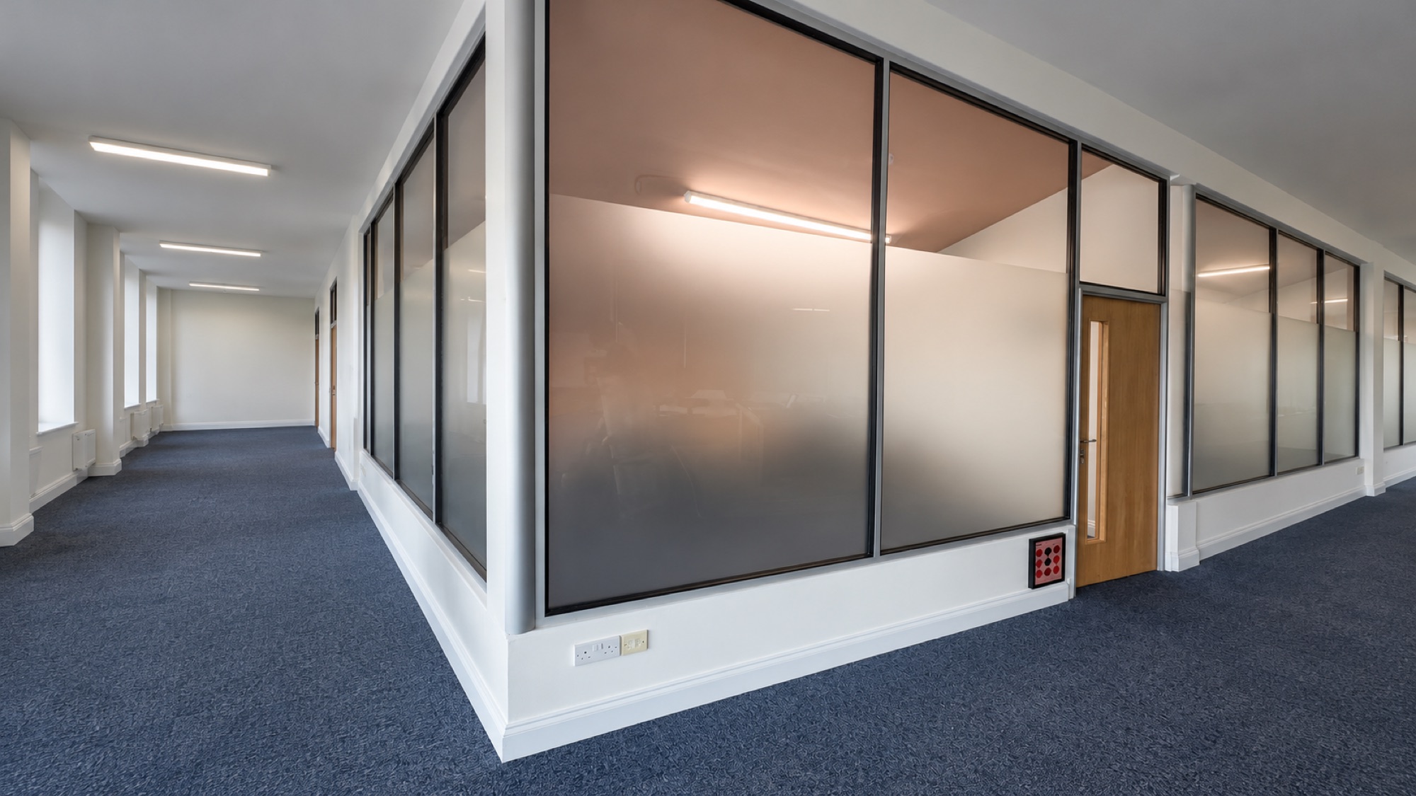
Frosted film applied across office glazing to reduce direct sightlines without giving up borrowed light.
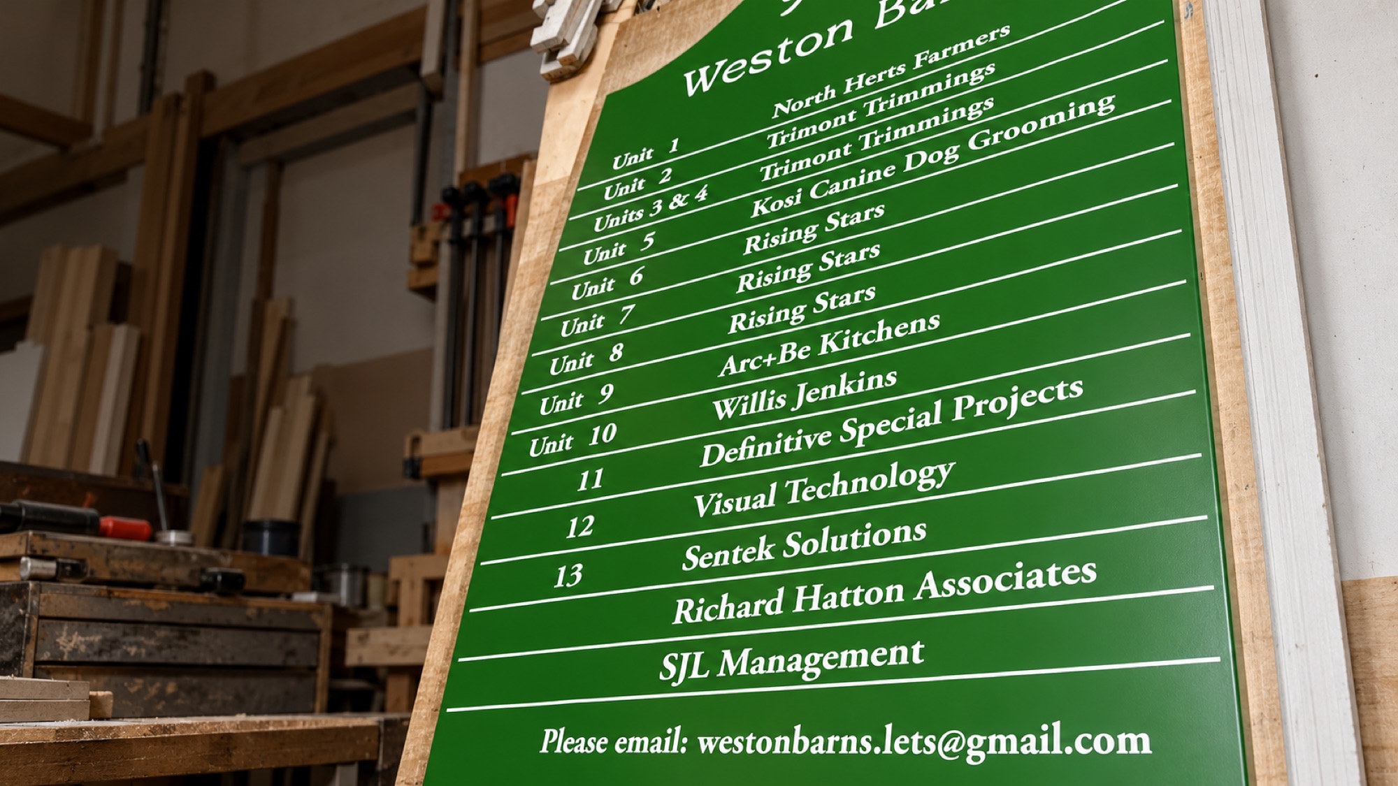
A high-contrast directory that organises a long list of units and occupiers into one readable board.
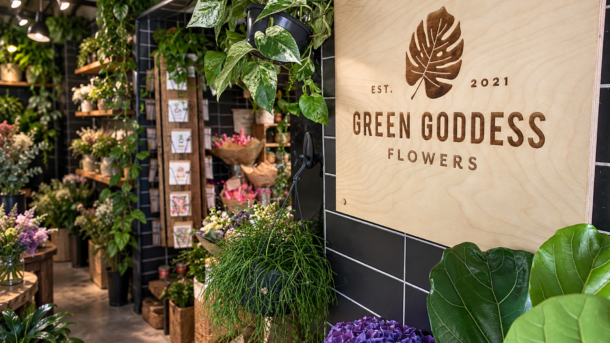
A timber-faced brand sign that feels at home among plants, flowers and natural display materials.
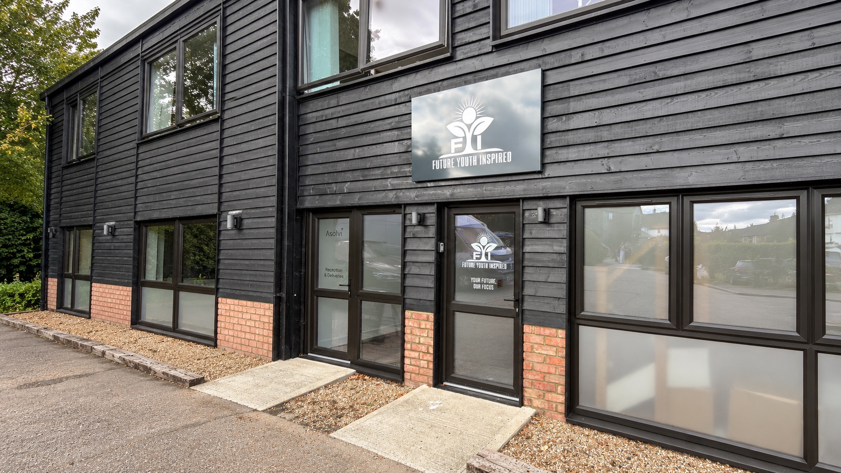
A coordinated exterior sign and entrance graphics that carry one identity across a dark timber-clad building.
Context first
The building, approach route, interior materials and viewing distance determine what the sign needs to do.
Information with hierarchy
Whether there are three logos or thirteen tenants, the order and spacing matter as much as the substrate.
Made for installation
Survey, access and fixing details are considered before artwork becomes finished signage.
What should we look at next?
Send us photographs of the site and a short description of what needs to change. We will identify the useful next step.